
5 Reasons Why Colors for Branding Matter (and how you can choose the right ones)

We live in a colorful world. And colors hold a lot of power and meaning—especially when it comes to marketing.
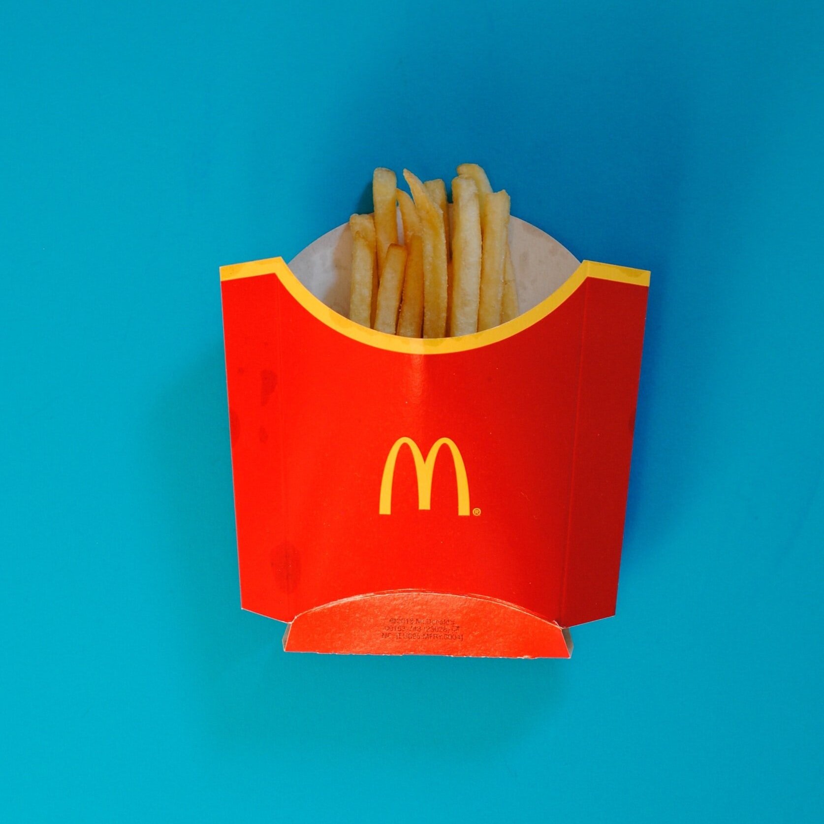
Let’s think about the brand colors for some popular fast food restaurants—McDonalds, Chick-fil-A, KFC, Pizza Hut, Wendy’s, Dairy Queen, etc. The common color theme is red and yellow. You see it all over their logos, packaging, buildings and dining spaces. On the opposite side of the spectrum are food businesses like Whole Foods, Starbucks, and Subway which are using green and earthier shades. But…why the differences? These big businesses know how color impacts their consumers and they are using branding to effectively convey and market their business.
Color is a visual experience, but it also has the power to influence decisions, evoke emotion and showcase personality. And yes, brands have personality (or should)! Choosing colors for branding should be done so that they are esthetically pleasing, but also with strategy.
So…let’s talk more about why colors for branding matter.
#1 Color is the first thing people see
When someone lands on a website, social media page, or sees a logo, before they read any words or absorb any images the very first thing they are going to notice is color.
Take a look at these two screenshots of Instagram feeds. Before you notice any of the words or content you first see color. The color sets the tone for these feeds immediately. At a quick glance you don’t even know what the business is, but you definitely get an impression of it from the color right away.


When it comes to websites there is lots of research that shows you have a very short amount of time to make a good impression. Google did their own research and found that you have less than 50 milliseconds to make a good impression. And with color being the first thing a visitor is going to notice, it’s important to be strategic in the use. Ensuring that you have brand colors that appeal to your audience and support your business goals is a key component of creating a good impression.
#2 Colors are more memorable than a logo
Unless you’re a household name like Apple or Google, your logo isn’t going to be the first thing someone remembers about your brand. (Without scrolling to the top of the page try to think what my logo looks like—you probably can’t!) It takes repeated exposure to a symbol for consumers to remember it in detail. However, using brand colors correctly and consistently in your logo and elsewhere throughout your marketing will have a much more memorable impact on your audience than a logo alone. If your website, social media profiles, and business cards all use the same exact color shades that establishes consistency and thus helps people remember your business. And again to the previous point, choosing colors should be done strategically so that they appeal to your ideal audience and your goals.
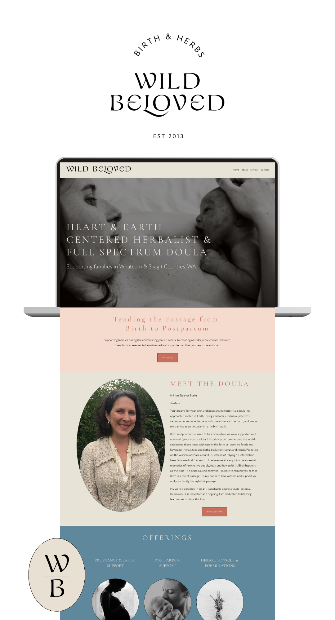
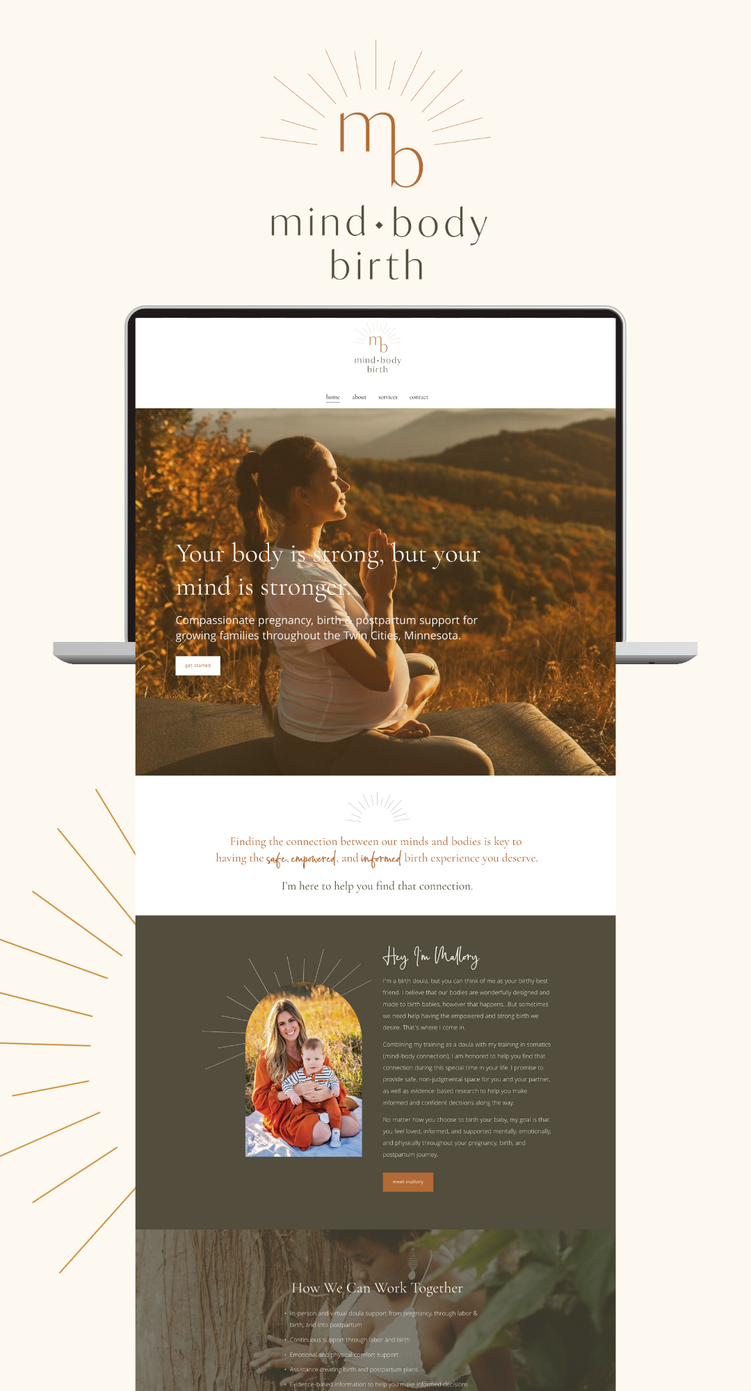
At the beginning of this post I talked about how many fast food restaurants use the colors red and yellow. But that does not mean you must use colors similar to your competitors. In fact, it can actually be far more effective to use completely different colors to help you stand out. For example, I see tons of birth & parenting businesses using blush pink and soft feminine shades and lots and lots of babies/belly graphics. You can do this too, but it doesn’t really help your brand stand out in a memorable way. Personally, it feels overdone and boring. I encourage you to use color to help you stand out! Check out two doulas I’ve supported below who have branding that is completely different.
#3 Colors give life and personality
The impact of color on mood has long been studied. One of the first published records is the Theory of Colors originally released in 1810. Many others since have studied the impact and the research shows that different colors (and even different shades of the same color) elicit different responses and moods. This is true even across cultures and there are ties of this connection traced to human evolution. But, to spare you the history lesson, there aren’t hard and fast rules. Some colors do have culture influences and different shades of the same color can have different impacts so let’s talk generally about some of the positive and negative emotions tied to colors:
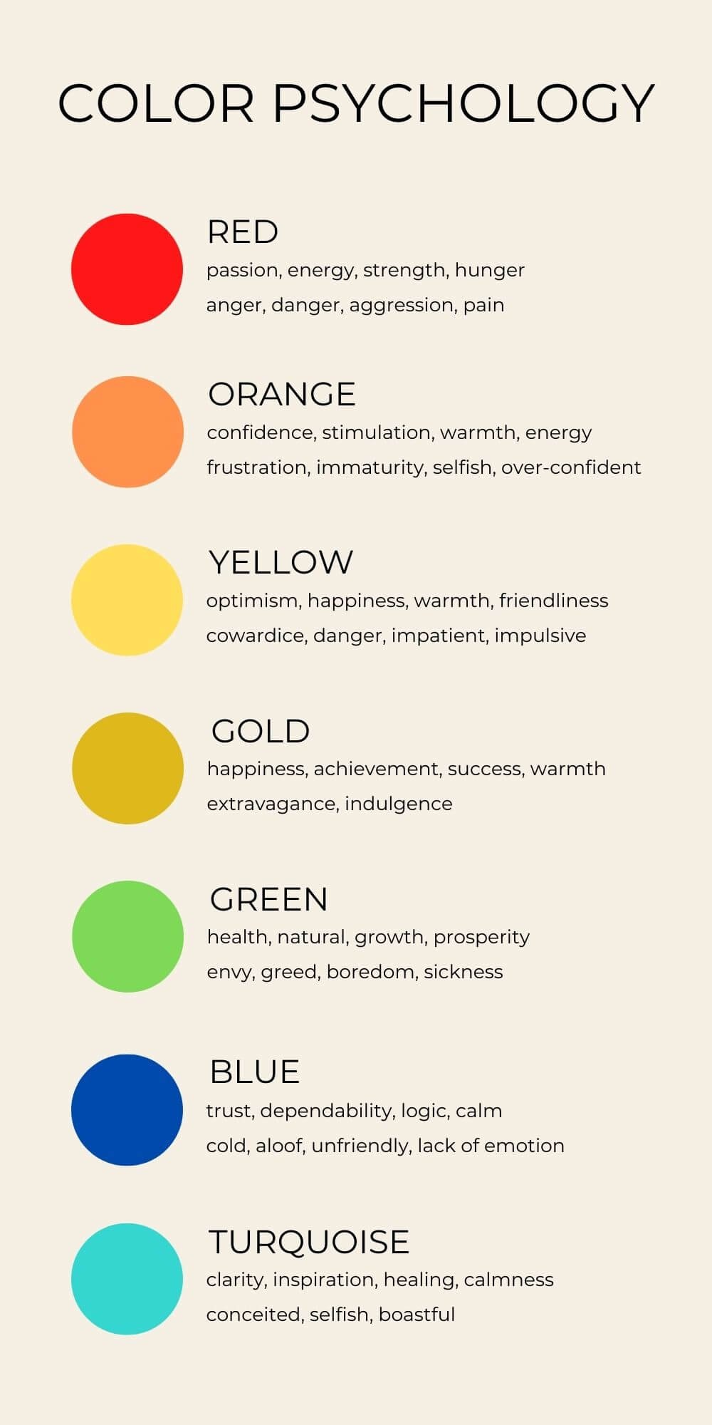
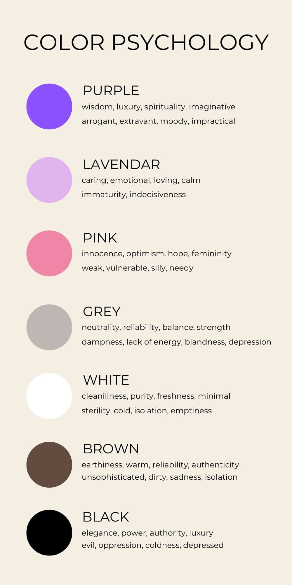
Color Psychology of Common Colors & Emotions Associated
And if you didn’t like the graphic here’s the list typed out.
Red
passion, energy, strength, hunger
anger, danger, aggression, pain
Orange
confidence, stimulation, warmth, energy
frustration, immaturity, selfish, over-confident
Yellow
optimism, happiness, warmth, friendliness
cowardice, danger, impatient, impulsive
Gold
happiness, achievement, success, warmth
extravagance, indulgence
Green
health, natural, growth, prosperity
envy, greed, boredom, sickness
Blue
trust, dependability, logic, calm
cold, aloof, unfriendly, lack of emotion
Turquoise
clarity, inspiration, healing, calmness
conceited, selfish, boastful
Purple
wisdom, luxury, spirituality, imaginative
arrogant, extravant, moody, impractical
Lavender
caring, emotional, loving, calm
immaturity, indecisiveness
Pink
innocence, optimism, hope, femininity
weak, vulnerable, silly, needy
Grey
neutrality, reliability, balance, strength
dampness, lack of energy, blandness, depression
White
cleaniliness, purity, freshness, minimal
sterility, cold, isolation, emptiness
Brown
earthiness, warmth, reliability, authenticity
unsophisticated, dirty, sadness, isolation
Black
elegance, power, authority, luxury
evil, oppression, coldness, depressed
#4 Consumers care more about how a brand makes them feel rather than what it actually does
Antonio Damasio is neuroscientist who studies emotions and the role they play in decision-making. His research has discovered that decisions are made largely not by logic, but rather based on emotion. So consumers decisions are driven by how they feel about a brand. And we know that colors have the ability to evoke emotion, so it’s important to choose brand colors that will illicit the emotion you’re seeking.
So let’s go back to our example about the fast food companies. The color red demands attention and evokes power and strength. Yellow is also attention-grabbing, but it also evokes happiness, positivity, and youthfulness. Both of these colors are bold, attention-grabbing, and are even thought to increase hunger, appetite, and metabolism. Fast food restaurants are quick, impulsive, and bold just like the brand colors and they also want you to make quick and bold decisions to purchase and consume their products.
On the opposite spectrum are brands like Whole Foods, Subway, and Starbucks. These companies are using green and earthier shades which convey a more healthy, natural product. Both genres of these food companies provide food, and while they all provide food (disregard the level of healthiness), there is no dispute that the branding of one feels and is perceived to be healthier than the other.
Colors have an enormous impact on the perception of a brand.


#5 Accessibility
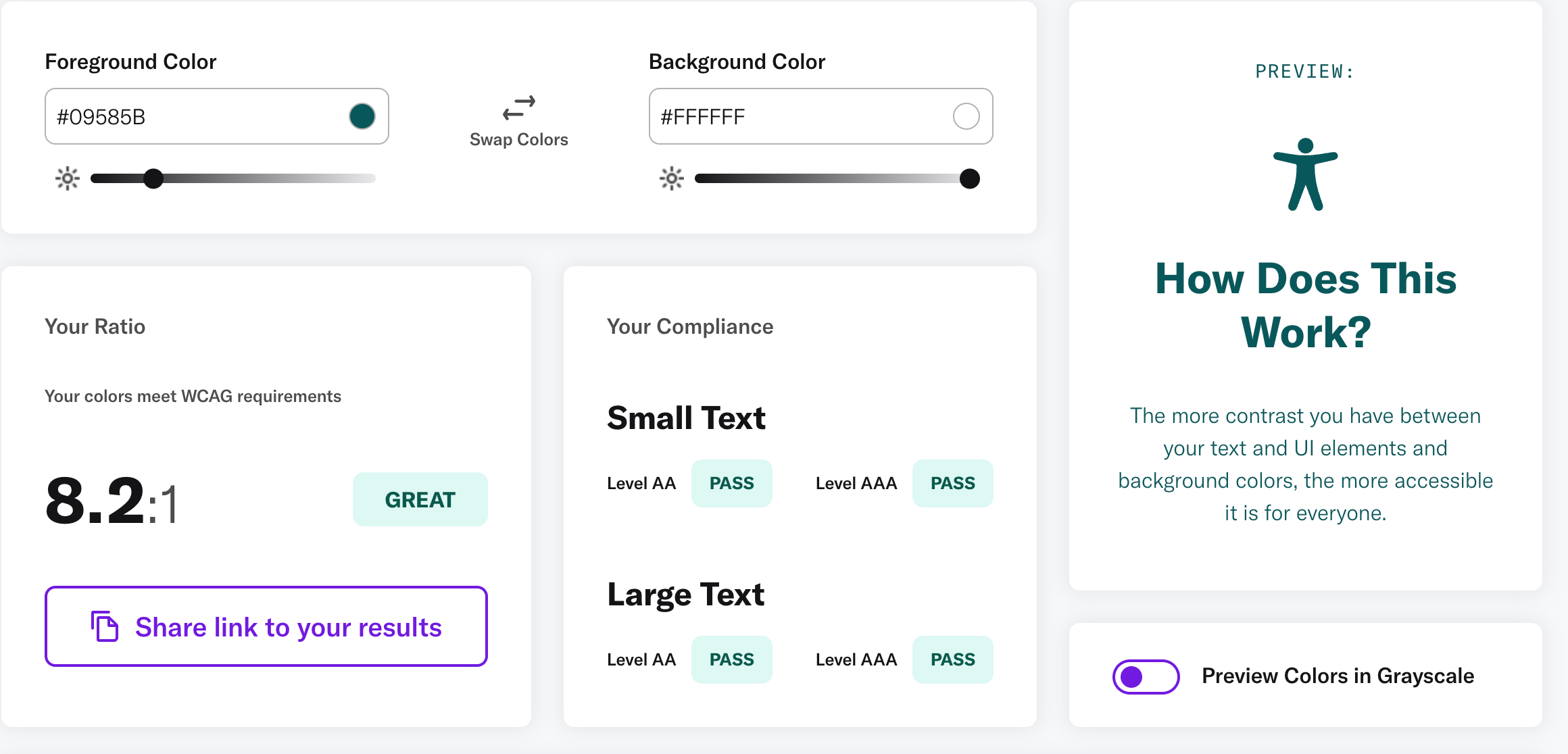
When it comes to choosing colors for your branding it is important to think of all people who may be viewing your content. Color accessibility is an often overlooked aspect of design that can limit people who have colorblindness or low vision. One of the easiest ways to ensure accessibility is to make sure that you’re using background and text colors with high contrast. This means that you’re using a light and dark shade to maximize the ease in which the content can be read and viewed. The most accessible combo is black text on a white background, but most dark shades with white are highly accessible. If you’re not sure if your colors are accessible you can check your brand colors through a free tool like Color Contrast Checker.
If you think your colors are easily readable and accessible, it’s still always a good idea to get feedback from others. Even individuals who do not have vision impairment may still struggle with color combinations so I recommend you always keep this in mind!
So how the heck do I pick colors for my brand?!
That was a lot of info and you might be feeling overwhelmed. The best advice is to start small! Don’t just dive into Canva and randomly pick colors you like. Before picking colors you need to get clear on your business values and goals. Make a list of adjectives that describe how you want to operate your business and be known and perceived. Then, start taking note of places and items that make you feel the way you want your customers to feel about you and your business. Pay attention to colors and textures. I love creating Pinterest mood boards to save images that are inspiring. And then, reference back to color psychology and find colors and shades that evoke those words and feelings you listed out. It’s work and it can take some time, but you can do it!
If you’re wanting a bit more help without the cost of custom support. Be sure to check out my free resources!


Ooftah! That was a lot of info. If you’ve still got questions or need help, apply to work with me. I’d love to chat.