BRAND DESIGN | SQUARESPACE WEBSITE DESIGN
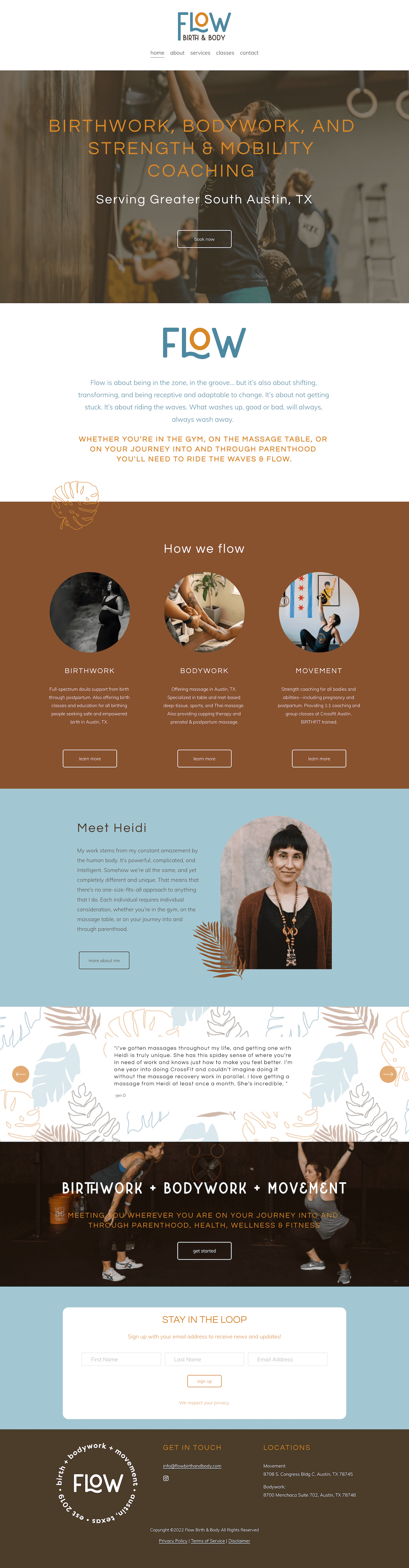
Flow Birth & Body
Heidi is a doula, massage therapist, and fitness coach based in Austin, TX. Her business is as multifaceted as she is and she came to me wanting help creating brand visuals that demonstrated the strength and flexibility.
The direction for Flow Birth & Body is strong and bold, yet clean and welcoming. The logo features a wavy L supporting the bold O. The wavy L is a play on movement and of course flow. The O stands as a bold circle representing the focus it takes when you get in the "flow" of whatever you're doing and is also a subtle nod to life cycle, fertility and strength because it can't be broken.
The color palette is earthy and grounding with the brown shades with added energy and strength from the orange shade. The blues bring a fluidity and lightness to the palette.
The visual cues that make up the rest of the brand are hand-drawn tropical plants. These are a strong and bold accent that compliments the strength of this brand. The botanical elements feel natural and playful are also of personal connection to Heidi’s roots. These elements also have symbolic ties to new life, growth, resilience and fertility which are important aspects of Flow.